User login
From the OpenLab, University Health Network, Toronto, Canada (Dr. Hahn-Goldberg, Dr. Okrainec, Dr. Abrams, Mr. Huynh); School of Health Policy and Management, York University, Toronto (Dr. Hahn-Goldberg); Toronto Central Local Health Integration Network (Ms. Damba); Centre for Addiction and Mental Health, Toronto (Ms. Solomon); and the Department of Medicine, University Health Network, Toronto (Dr. Okrainec, Dr. Abrams).
Abstract
- Objective: To describe the co-design process we under-took to create a patient-oriented discharge summary (PODS) with patients, caregivers, and providers.
- Method: Descriptive report.
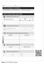
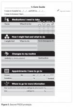
- Results: We designed and produced a prototype PODS, based on best practices in information design, graphic design, and patient education. Through a co-design process, patients, health care providers, designers and system planners worked together to establish what content needed to be included, as well as how it would be organized and presented. From an initial prototype, we then refined the PODS through an iterative participatory design process involving patients, including those from hard-to-reach groups such as patients with language barriers and/or low health literacy and patients with a primary psychiatric diagnosis.
- Conclusion: Co-design events and targeted focus groups are very useful for engaging patients and caregivers in the design and development of solutions aimed at improving their experience of care. It is important to include all users, especially those who are harder to reach, such as patients with language barriers and mental health conditions. Engaging health care providers is essential to ensure feasibility of those solutions.
Traditional discharge summaries are written primarily for the patient’s primary care provider and are not designed as tools to support communication between the clinician and patient regarding instructions for patients to follow at home post discharge. A more patient-centered version of the discharge summary is needed to complement the traditional format.
To enhance our patients’ care experience in the post-discharge period, we set out to co-design a patient-oriented discharge summary (PODS) with patients, caregivers, and providers. The main objective of this project was to develop a prototype PODS that not only addressed critical information that patients felt was the most important to know following discharge, but also provided this information in the most comprehensible format at hospitals within the Toronto area. The project focused on reformatting patient-care instructions for patients discharged from inpatient medical wards as these instructions presented the best opportunity for improvement.
This project drew on work done in countries such as India, South Africa, and Pakistan, where challenges with general and health literacy have led to the introduction of simplified discharge forms and medication instructions that place a greater emphasis on visual communication to improve information comprehension. For example, the use of pictograms in patient materials has been shown to increase patient understanding of and compliance with care instructions in these countries [1–3].
We have provided an overview of the PODS project elsewhere [4]. In this article, we describe the co-design process we undertook with patients, health care providers, and designers in creating a PODS.
Design Methods
We used several methods to design and develop the PODS and to engage multiple stakeholders in the design process. Among these methods were innovative techniques for understanding the patient experience of discharge, such as cultural probes [5], where patients were given journals and cameras to document their time at home after discharge, as described by Hahn-Goldberg et al [4]. Other key methods for determining the design of the PODS included:
Patient education consultation. A patient education representative with training and expertise in designing materials for patients with low health literacy was added to the team advisory committee to act as a consultant at all stages of the study. This helped to ensure that we would be following best practices in design for our target population.
Review of literature. We reviewed the literature pertaining to design for patients with low health literacy and language barriers, including the resources available through the patient education department at the University Health Network.
Review of Toronto Central Local Health Integration Network (TCLHIN) hospitals’ tools: current discharge summaries, components they included and how they were formatted.
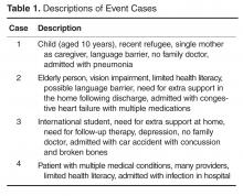
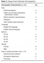
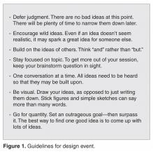
Co-design event. We held an interprofessional design event where teams of patients, health care providers, and designers worked together to create draft PODS for 4 hypothetical patient cases.
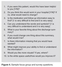
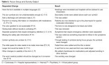
Focus groups and surveys. We used feedback from focus groups and surveys to revise and improve the first PODS prototype.
Insights from the Literature
Studies have shown that multiple interventions tend to increase adherence, that self-management should be encouraged, and that modes of communication other than verbal must be used [6]. Visual cues, such as pictures or symbols, are useful to help with recall of medications and instructions for people with language barriers or limited health literacy [7]. Simplified written instructions and larger fonts have been found to be effective in patients with language barriers or limited health literacy, as have use of illustrated medication schedules [8]. Other guidelines include using short words and sentences, writing directly to the reader, listing important points in list format, and using left justification so there is even spacing between words.
The literature is consistent with our findings from speaking with patient education representatives and patients. Patients and caregivers noted that the PODS should be written in plain language, use large fonts, include illustrations of care and medication schedules, and include headings that are meaningful to the patient. Patients also expressed the desire for charts and lists that they could use while completing their follow-up care plan.
“My mom made me a chart of when to drink water and how much (patient).”
“We were given a sheet to record all feedings (caregiver).”
“We can provide a list of patient meds in a grid format with days of the week and times of day. We use our judgement to give this to patients. It is not standard practice (pharmacist).”
“A discharge form in ‘plain English’ should be standardized (patient).”
The Co-design Event
Solutions resulting from the design event ranged from more traditional discharge summaries that were enhanced with multiple languages and images to make things clear for patients, to solutions including interactive patient portals. There were solutions that came with stickers to color-code your medications, areas for patients to write notes, and checklists for them to keep track of all their follow-up plans.
Refining the Design Using Focus Groups and Surveys
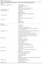
The ideas and concepts generated during the design event were analyzed by the interdisciplinary advisory team at OpenLab. In addition, several team sessions were held with health care
This is a great piece. You guys are doing an awesome job. This would have saved me so much anxiety and fear of doing something wrong when I was discharged. I didn’t want to bother my doctors and went on a hope and prayer. Even my home care people weren’t always sure of what to do. Again this would be a great step forward in easing patients’ fears, especially senior citizens. GREAT WORK. THANKS FOR CARING.
Discussion
Innovative methods such as co-design events and targeted focus groups are very useful for
Future Plans
The PODS template has now been adapted and implemented in several hospitals in Toronto, Canada, using a supported early adopter process [10]. Future plans are to test the impact of the PODS on patient experience and health outcomes using a randomized controlled trial. Also, for now, we have focused on a paper version of PODS, but with the increasing prevalence of electronic health records and consumer-oriented health care apps, future consideration for a digital and mobile version of PODS is warranted.
Conclusion
Patients need to be prepared for discharge so that they can engage in supported self-management once they return home.
Corresponding author: Shoshana Hahn-Goldberg, PhD, 294 Mullen Dr., Thornhill, ON L4J 2P2.
Funding/support: The PODS project has been funded by the Toronto Central Local Health Integration Network.
Financial disclosures: None.
1. Rajesh R, Vidyasagar S, Varma M, Sharma S. Design And evaluation of pictograms for communicating information about adverse drug reactions to antiretroviral therapy in Indian human immunodeficiency virus positive patients. J Pharm Biomed Sci 2012;16:1–11.
2. Dowse R, Ehlers MS. The evaluation of pharmaceutical pictograms in a low-literate South African population. Patient Educ Couns 2001;45:87–99.
3. Clayton M, Syed F, Rashid A, Fayyaz U. Improving illiterate patients’ understanding and adherence to discharge medications. BMJ Qual Improv Rep 2012;1:u496.w167.
4. Hahn-Goldberg S, Okrainec K, Huynh T, et al. Co-creating patient-oriented instructions with patients, caregivers, and providers. J Hosp Med 2015;10:804–7.
5. Gaver B, Dunne T, Pacenti E. Design: cultural probes. Interactions 1999;6:21–9.
6. Sheridan SL, Halpern DJ, Viera AJ, et al. Interventions for individuals with low health literacy: a systematic review. J Health Commun 2011;16 Suppl 3:30–54.
7. Schillinger D, Machtinger EL, Wang F, et al. Language, literacy, and communication regarding medications in an anticoagulation clinic: A comparison of verbal vs. visual assessment. J Health Commun 2006;11:651–4.
8. Chugh A, Williams MV, Grigsby J, Coleman EA. Better transitions: Improving comprehension of discharge instructions. Front Health Serv Manage 2009;25:11–32.
9. IDEO. Design thinking for educators toolkit. 2nd ed. New York: IDEObooks; 2013.
10. Hahn-Goldberg S, Okrainec K, Damba C, et al. Implementing patient oriented discharge summaries (PODS): A multi-site pilot across early adopter hospitals. Healthc Q 2016;19:42–8.
From the OpenLab, University Health Network, Toronto, Canada (Dr. Hahn-Goldberg, Dr. Okrainec, Dr. Abrams, Mr. Huynh); School of Health Policy and Management, York University, Toronto (Dr. Hahn-Goldberg); Toronto Central Local Health Integration Network (Ms. Damba); Centre for Addiction and Mental Health, Toronto (Ms. Solomon); and the Department of Medicine, University Health Network, Toronto (Dr. Okrainec, Dr. Abrams).
Abstract
- Objective: To describe the co-design process we under-took to create a patient-oriented discharge summary (PODS) with patients, caregivers, and providers.
- Method: Descriptive report.
- Results: We designed and produced a prototype PODS, based on best practices in information design, graphic design, and patient education. Through a co-design process, patients, health care providers, designers and system planners worked together to establish what content needed to be included, as well as how it would be organized and presented. From an initial prototype, we then refined the PODS through an iterative participatory design process involving patients, including those from hard-to-reach groups such as patients with language barriers and/or low health literacy and patients with a primary psychiatric diagnosis.
- Conclusion: Co-design events and targeted focus groups are very useful for engaging patients and caregivers in the design and development of solutions aimed at improving their experience of care. It is important to include all users, especially those who are harder to reach, such as patients with language barriers and mental health conditions. Engaging health care providers is essential to ensure feasibility of those solutions.
Traditional discharge summaries are written primarily for the patient’s primary care provider and are not designed as tools to support communication between the clinician and patient regarding instructions for patients to follow at home post discharge. A more patient-centered version of the discharge summary is needed to complement the traditional format.
To enhance our patients’ care experience in the post-discharge period, we set out to co-design a patient-oriented discharge summary (PODS) with patients, caregivers, and providers. The main objective of this project was to develop a prototype PODS that not only addressed critical information that patients felt was the most important to know following discharge, but also provided this information in the most comprehensible format at hospitals within the Toronto area. The project focused on reformatting patient-care instructions for patients discharged from inpatient medical wards as these instructions presented the best opportunity for improvement.
This project drew on work done in countries such as India, South Africa, and Pakistan, where challenges with general and health literacy have led to the introduction of simplified discharge forms and medication instructions that place a greater emphasis on visual communication to improve information comprehension. For example, the use of pictograms in patient materials has been shown to increase patient understanding of and compliance with care instructions in these countries [1–3].
We have provided an overview of the PODS project elsewhere [4]. In this article, we describe the co-design process we undertook with patients, health care providers, and designers in creating a PODS.
Design Methods
We used several methods to design and develop the PODS and to engage multiple stakeholders in the design process. Among these methods were innovative techniques for understanding the patient experience of discharge, such as cultural probes [5], where patients were given journals and cameras to document their time at home after discharge, as described by Hahn-Goldberg et al [4]. Other key methods for determining the design of the PODS included:
Patient education consultation. A patient education representative with training and expertise in designing materials for patients with low health literacy was added to the team advisory committee to act as a consultant at all stages of the study. This helped to ensure that we would be following best practices in design for our target population.
Review of literature. We reviewed the literature pertaining to design for patients with low health literacy and language barriers, including the resources available through the patient education department at the University Health Network.
Review of Toronto Central Local Health Integration Network (TCLHIN) hospitals’ tools: current discharge summaries, components they included and how they were formatted.
Co-design event. We held an interprofessional design event where teams of patients, health care providers, and designers worked together to create draft PODS for 4 hypothetical patient cases.
Focus groups and surveys. We used feedback from focus groups and surveys to revise and improve the first PODS prototype.
Insights from the Literature
Studies have shown that multiple interventions tend to increase adherence, that self-management should be encouraged, and that modes of communication other than verbal must be used [6]. Visual cues, such as pictures or symbols, are useful to help with recall of medications and instructions for people with language barriers or limited health literacy [7]. Simplified written instructions and larger fonts have been found to be effective in patients with language barriers or limited health literacy, as have use of illustrated medication schedules [8]. Other guidelines include using short words and sentences, writing directly to the reader, listing important points in list format, and using left justification so there is even spacing between words.
The literature is consistent with our findings from speaking with patient education representatives and patients. Patients and caregivers noted that the PODS should be written in plain language, use large fonts, include illustrations of care and medication schedules, and include headings that are meaningful to the patient. Patients also expressed the desire for charts and lists that they could use while completing their follow-up care plan.
“My mom made me a chart of when to drink water and how much (patient).”
“We were given a sheet to record all feedings (caregiver).”
“We can provide a list of patient meds in a grid format with days of the week and times of day. We use our judgement to give this to patients. It is not standard practice (pharmacist).”
“A discharge form in ‘plain English’ should be standardized (patient).”
The Co-design Event
Solutions resulting from the design event ranged from more traditional discharge summaries that were enhanced with multiple languages and images to make things clear for patients, to solutions including interactive patient portals. There were solutions that came with stickers to color-code your medications, areas for patients to write notes, and checklists for them to keep track of all their follow-up plans.
Refining the Design Using Focus Groups and Surveys
The ideas and concepts generated during the design event were analyzed by the interdisciplinary advisory team at OpenLab. In addition, several team sessions were held with health care
This is a great piece. You guys are doing an awesome job. This would have saved me so much anxiety and fear of doing something wrong when I was discharged. I didn’t want to bother my doctors and went on a hope and prayer. Even my home care people weren’t always sure of what to do. Again this would be a great step forward in easing patients’ fears, especially senior citizens. GREAT WORK. THANKS FOR CARING.
Discussion
Innovative methods such as co-design events and targeted focus groups are very useful for
Future Plans
The PODS template has now been adapted and implemented in several hospitals in Toronto, Canada, using a supported early adopter process [10]. Future plans are to test the impact of the PODS on patient experience and health outcomes using a randomized controlled trial. Also, for now, we have focused on a paper version of PODS, but with the increasing prevalence of electronic health records and consumer-oriented health care apps, future consideration for a digital and mobile version of PODS is warranted.
Conclusion
Patients need to be prepared for discharge so that they can engage in supported self-management once they return home.
Corresponding author: Shoshana Hahn-Goldberg, PhD, 294 Mullen Dr., Thornhill, ON L4J 2P2.
Funding/support: The PODS project has been funded by the Toronto Central Local Health Integration Network.
Financial disclosures: None.
1. Rajesh R, Vidyasagar S, Varma M, Sharma S. Design And evaluation of pictograms for communicating information about adverse drug reactions to antiretroviral therapy in Indian human immunodeficiency virus positive patients. J Pharm Biomed Sci 2012;16:1–11.
2. Dowse R, Ehlers MS. The evaluation of pharmaceutical pictograms in a low-literate South African population. Patient Educ Couns 2001;45:87–99.
3. Clayton M, Syed F, Rashid A, Fayyaz U. Improving illiterate patients’ understanding and adherence to discharge medications. BMJ Qual Improv Rep 2012;1:u496.w167.
4. Hahn-Goldberg S, Okrainec K, Huynh T, et al. Co-creating patient-oriented instructions with patients, caregivers, and providers. J Hosp Med 2015;10:804–7.
5. Gaver B, Dunne T, Pacenti E. Design: cultural probes. Interactions 1999;6:21–9.
6. Sheridan SL, Halpern DJ, Viera AJ, et al. Interventions for individuals with low health literacy: a systematic review. J Health Commun 2011;16 Suppl 3:30–54.
7. Schillinger D, Machtinger EL, Wang F, et al. Language, literacy, and communication regarding medications in an anticoagulation clinic: A comparison of verbal vs. visual assessment. J Health Commun 2006;11:651–4.
8. Chugh A, Williams MV, Grigsby J, Coleman EA. Better transitions: Improving comprehension of discharge instructions. Front Health Serv Manage 2009;25:11–32.
9. IDEO. Design thinking for educators toolkit. 2nd ed. New York: IDEObooks; 2013.
10. Hahn-Goldberg S, Okrainec K, Damba C, et al. Implementing patient oriented discharge summaries (PODS): A multi-site pilot across early adopter hospitals. Healthc Q 2016;19:42–8.
